Gather
UI & UX application
Read: 5–6 minutes
The brief was to design a web app that could adapt to
multiple devices, mainly mobile and desktop, and also
designing to meet the user’s needs. This project placed a lot
of emphasis on user experience which challenged me in creating
design solutions to make a web app that was both intuitive
and usable to the users.
Gather is an in-browser web application designed for
people suffering from mental states. More specifically, it
aims to combat these mental states, such as stress, anxiety,
and depression through growing fruits and vegetables
easily and accessibly indoors.
The name is a play on the literal meaning on the word
gather, it can for example mean to gather something from
the garden or to gather one’s thoughts, creating an
umbrella term that made it appropriate for a web app about
growing and mental health.
The idea behind using growing as a medium of support was
based on research
that looked into the effects of gardening
and how it was a healthy activity for mental health, and is
also known to be quite therapeutic and sometimes is a
recommended activity by doctors.
Gather puts a focus on growing indoors specifically to
reach people that live in rural areas and heavily populated
cities, such as London or Birmingham, as these areas are
'concrete jungles' that rarely offer housing with
appropriate outdoor garden or lawn. There is also data
compiled showing cities in the UK that are the most
stressful to live in, with highly populated cities tending to
carry the most stress.
User interviews were conducted; a handful of people, with
characteristics that fit the concept of Gather, were picked
as a small user group and each asked a series of questions.
This was necessary to understand the user demographics,
behaviour, and establish certain expectations or goals that
these users may have towards the app.
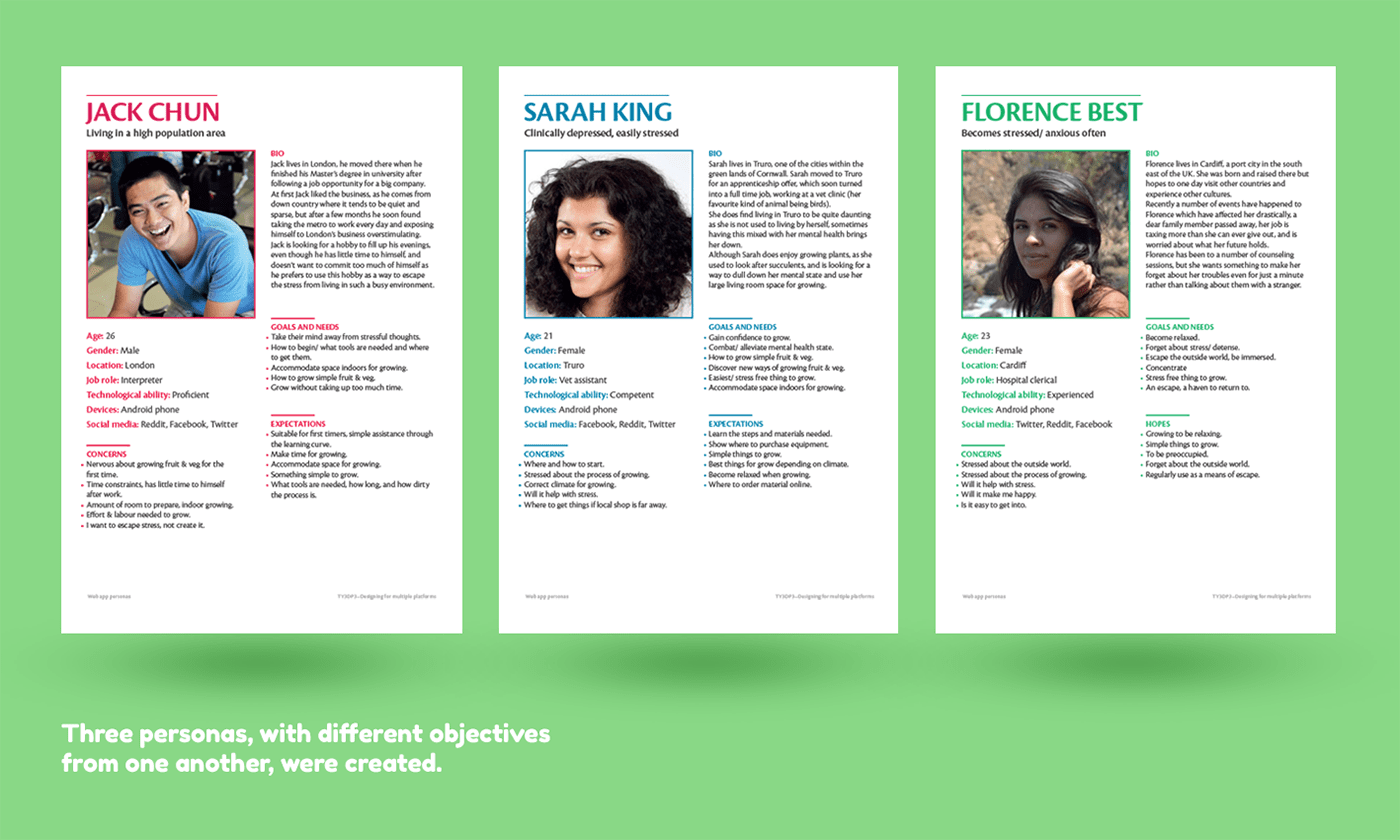
Three personas, based on the interviewees, were created to show the user’s expectations, goals, behaviour, and triggers towards the app. This was necessary as I was now able to establish my target user group for the app which would later on influence my design decisions to cater towards the user.
With a user group established, I was then able to create a user journey based on the personas. This would help to establish user goals from triggers and what steps they would expect to take in order for them to reach their goal, each trigger being a verb as no pages had been established by this stage.
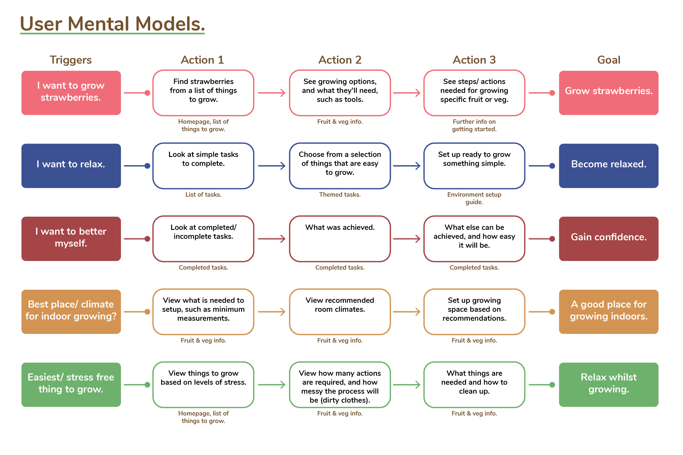
For example, a user trigger would be “I want to grow strawberries” with the end goal for the user being to simply “grow strawberries”. The necessary steps that the user might expect would be to perhaps look at a list of things that they could grow, look at some information relating to perhaps what they’ll need for growing, and to see the necessary steps needed to grow what they want.
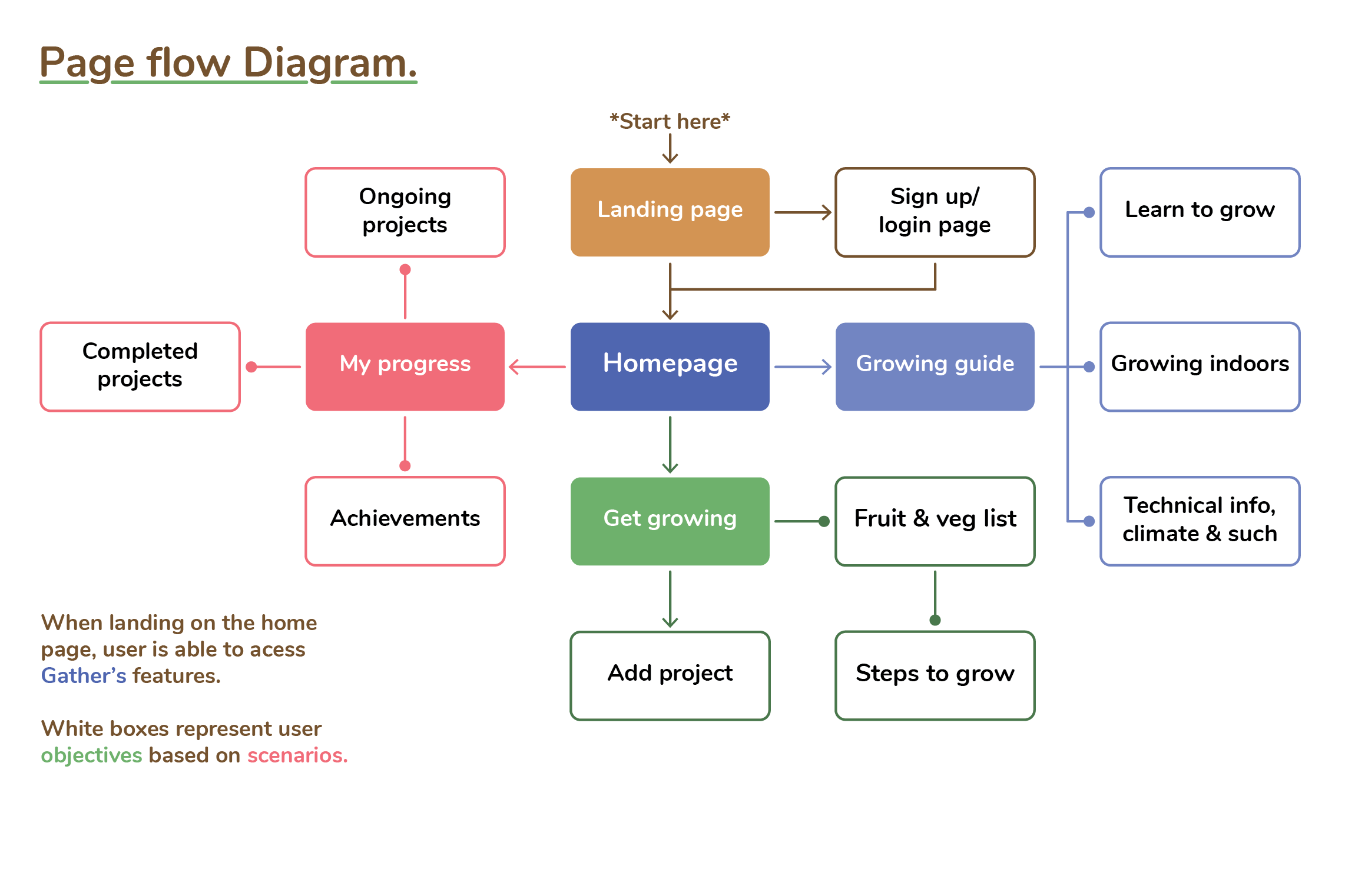
Once these steps were established I was able to map out this user journey into a page flow diagram, creating the pages needed to achieve the goals within the user journey.
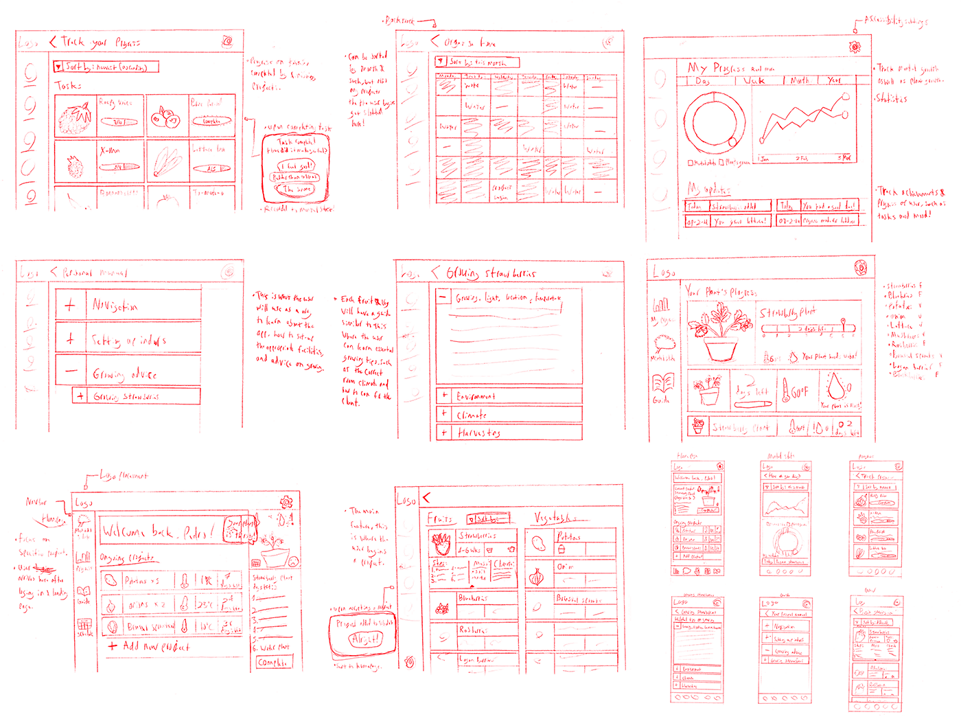
Next came sketching what the pages might look like, such as thinking about what functions would help the user in completing their objective and how it all could look roughly. This step was more thinking about how each page would help the user than how they looked. This was also to get an idea of how each page might look for the necessary devices, desktop and mobile, as this is also necessary in making sure that each page works in fulfilling the user goals for the required screen sizes.
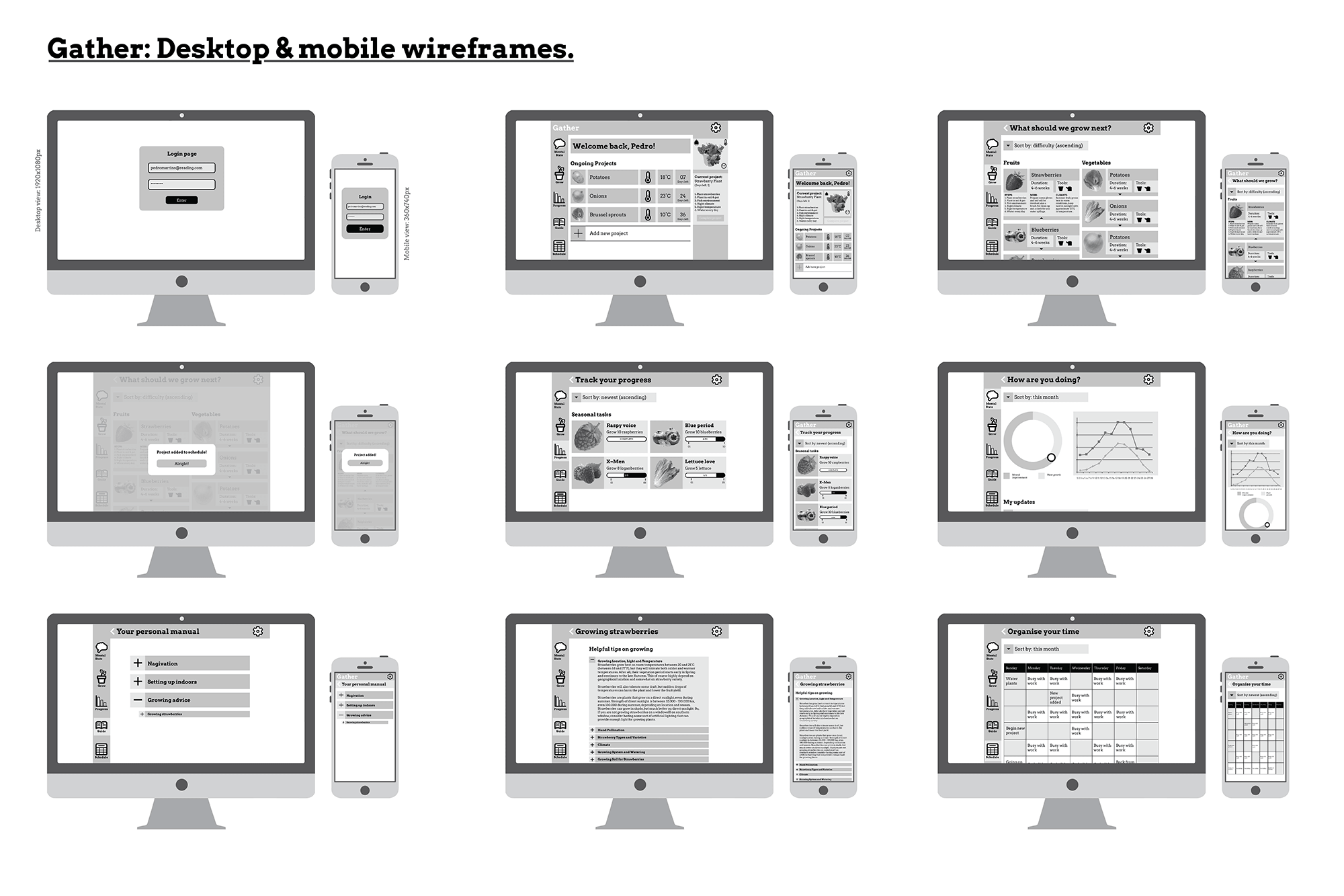
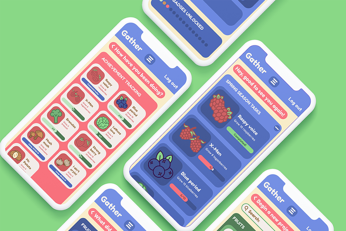
Clickable UI prototype made with Figma, based on the wireframe sketches. Only the most essential functions would work as this was not the final prototype, this was just to get an idea on how the app might work as a final product. This prototype later underwent user testing where I observed and recorded the users’ actions as they interacted with it, which would later tell me what worked and what didn’t work.
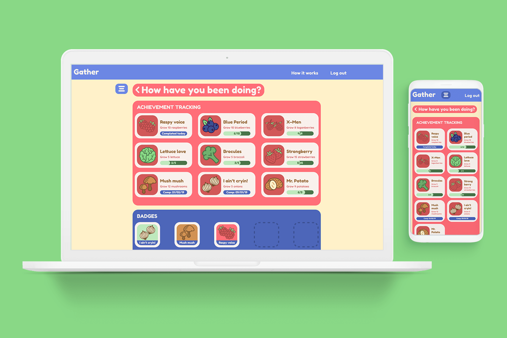
Once iterations had been made, the final prototype was finished. This also went through another round of user testing, which allowed for me to reiterate the app to not only function better but to also cater to the user needs much more efficiently. This project was a whole lot of fun as it allowed me to explore and think about the user in such an in–depth that I had never done before, it was a fulfilling experience and one that I would love to do again.