lmmartins
Carpentry website design
Read: 2–3 minutes
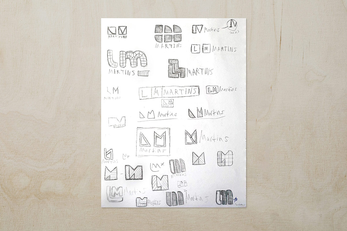
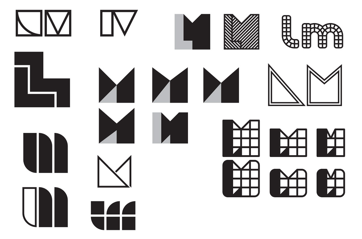
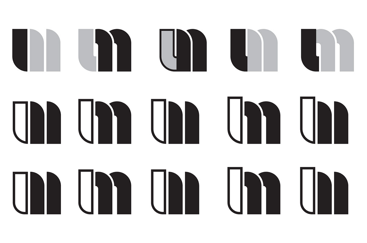
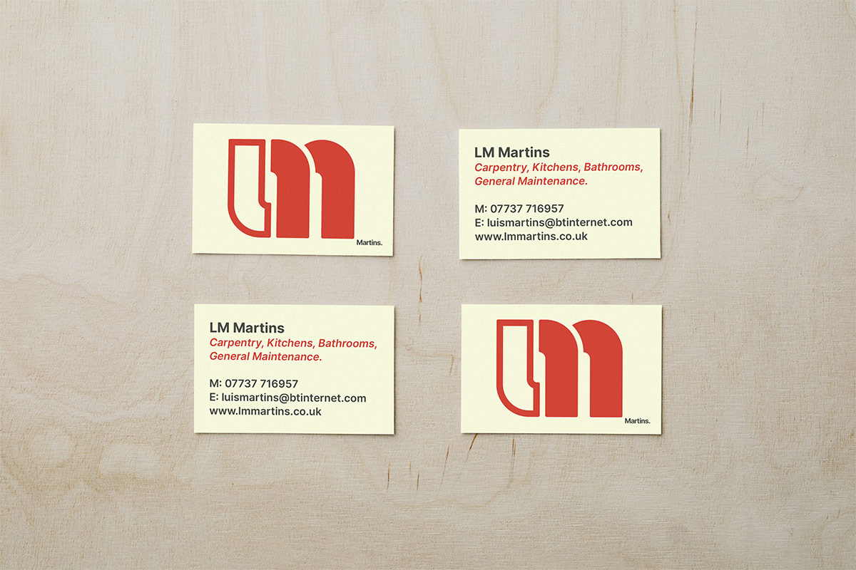
Brief was to design a brand identity for LM Martins, a highly skilled fitter with a lot of professional experience to his trade. I was responsible for designing the logo, business cards, invoice templates, and a responsive website to showcase his work.
From looking at my client’s past work, I spotted a striking resemblance to the swiss design movement. The use of grids for alignment, mathematical measurements, and optical compositions were all reminiscent to Swiss design and all present within the client’s works.
I was pleased to have made this discovery as I take a great deal of inspiration from the swiss design movement in all my works, therefore the next step was creating an identity that followed Swiss design principles whilst also sticking true to the mathematical works from LM Martins.
The website features mostly images with very little text at all, as it was best for the images to do the talking rather than explaining what they show, therefore this was a great opportunity to introduce a swiss like grid to show off mathematical precision and swiss principles.
The swiss like grid is the main aspect of the website and it was really challenging making it look like a wall that has been tiled, especially since the photos are both portrait and landscape so making everything align perfectly was tricky, but after using 110% of my brain I was able to create a very satisfying masonry grid.
I am proud to say that the finished designs not only follow the conventions of the swiss design movement but they also best represent the client’s mathematical and precise way of working.
lmmartins
Carpentry website design
Read: 2–3 minutes
Brief was to design a brand identity for LM Martins, a highly skilled fitter with a lot of professional experience to his trade. I was responsible for designing the logo, business cards, invoice templates, and a responsive website to showcase his work.


I was pleased to have made this discovery as I take a great deal of inspiration from the swiss design movement in all my works, therefore the next step was creating an identity that followed Swiss design principles whilst also sticking true to the mathematical works from LM Martins.


The website features mostly images with very little text at all, as it was best for the images to do the talking rather than explaining what they show, therefore this was a great opportunity to introduce a swiss like grid to show off mathematical precision and swiss principles.

I am proud to say that the finished designs not only follow the conventions of the swiss design movement but they also best represent the client’s mathematical and precise way of working.