The Power of Scale
Conference branding
Read: 2–3 minutes
Brief was to create a branding for an architectural
conference for Riba with the main theme being
wellbeing for the people. This proved challenging
to create a visual concept as there were a lot of
aspects to consider for this event; the first
problem being how to show an architectural based
poster whilst also showing people’s wellbeing.
The idea of having jenga blocks as a concept took
some time to deduce, for such a complex theme,
however having something playful representing the
event was appropriate as architecture can also be
a fun process especially when designing for others.
A fun nod to this can be seen on the poster and how
each block was literally hand printed, showing a
human element.
Banners were made to attract attention and
promote the event; both mockups produced show
how it can be advertised appropriately for both
outdoors and indoors. The trickiest part about
this was fitting the design from the poster onto
other size formats, without changing the brand
concept otherwise this would have broken
consistency for the event’s image.
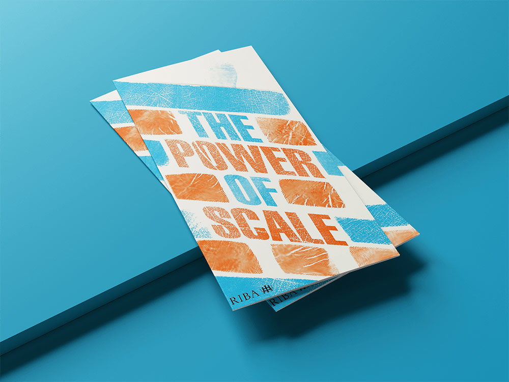
The leaflet contains more information about the
event, such as speakers and talk times, which
would be handed out to visitors as they arrived
inside on the day of the event. The design still
contains the jenga elements as the cover however
on the inside it’s different as there are
fingerprints placed around the leaflet, these
are not placed randomly as instead they are more
or less where the person is able to hold the
leaflet to read the information, and legibility
is not affected by having these with text.
The Power of Scale
Conference branding
Read: 2–3 minutes
Brief was to create a branding for an architectural
conference for Riba with the main theme being
wellbeing for the people. This proved challenging
to create a visual concept as there were a lot of
aspects to consider for this event; the first
problem being how to show an architectural based
poster whilst also showing people’s wellbeing.
The idea of having jenga blocks as a concept took
some time to deduce, for such a complex theme,
however having something playful representing the
event was appropriate as architecture can also be
a fun process especially when designing for others.
A fun nod to this can be seen on the poster and how
each block was literally hand printed, showing a
human element.


Banners were made to attract attention and
promote the event; both mockups produced show
how it can be advertised appropriately for both
outdoors and indoors. The trickiest part about
this was fitting the design from the poster onto
other size formats, without changing the brand
concept otherwise this would have broken
consistency for the event’s image.

The leaflet contains more information about the
event, such as speakers and talk times, which
would be handed out to visitors as they arrived
inside on the day of the event. The design still
contains the jenga elements as the cover however
on the inside it’s different as there are
fingerprints placed around the leaflet, these
are not placed randomly as instead they are more
or less where the person is able to hold the
leaflet to read the information, and legibility
is not affected by having these with text.

